Visualizing the chemical space
Jun 29, 2022

After creating models for drug classification, we need a practical way of visualizing our chemical space and verifying our results. This guide will walk you through how to generate an interactive plotly graph of chemicals that renders 2D images of molecules on hover. A good library for this is molplotly, and the below tutorial teaches you how to write and customize your own code for this.
We will cover two different types of chemical representations (Morgan fingerprint and RDKit 2D molecular descriptors), two different techniques for dimension reduction (PCA and t-SNE), generating a scatterplot in plotly, and creating an interactive Dash app which displays structures on hover. We’ll be using the BACE dataset from MoleculeNet. All of the code is located in our “Putting Everything Together” section at the end, but we recommend reading through the sections to fully understand how everything works.Let’s get started! 🙂
Chemical representations
Morgan Fingerprints
RDKit provides a function for converting SMILES into Morgan fingerprints that requires the fingerprint radius and number of bits. It is common to use a radius of 2 or 3 and at least 1024 bits. Higher bit values will allow you to retain more information about the molecule. In order to perform PCA or t-SNE, we convert the fingerprint into a 1d numpy array.
RDKit 2D Normalized Descriptor
Descriptastorus is a package for that allows us to efficiently generate a wide range of molecular descriptors from chemical SMILES. Luckily for us, they are also able to calculate and normalize the 2D molecular descriptors provided in RDKit.
The output of processing a SMILES on the RDKit2DNormalized generator is a 1d array.
Dimensionality Reduction
Principal Component Analysis
The scikit-learn package provides a function to perform PCA. We just need to pass in our dataset as an array of the molecules’ chemical representations (chem_rep_list) and specify the number of components. To plot this on a graph, we are limited to 2 or 3 components.
t-Distributed Stochastic Neighborhood Embedding
Alternatively, we can use t-SNE to reduce the number of dimensions. However, this technique is more computationally heavy, so it’s recommended to use PCA first to reduce the data down to around 50 dimensions.
The t-SNE function has many parameters. We recommend modifying them within a range as different values can give dramatically different results.
Graphing with Plotly
We can use any of the chemical representations above with any of the dimension reduction techniques. Let’s combine some of the code we’ve written to create a function that allows us to generate a plotly graph.
We will use the BACE dataset and attempt to generate a chemical visualization that distinguishes molecules by pIC50.
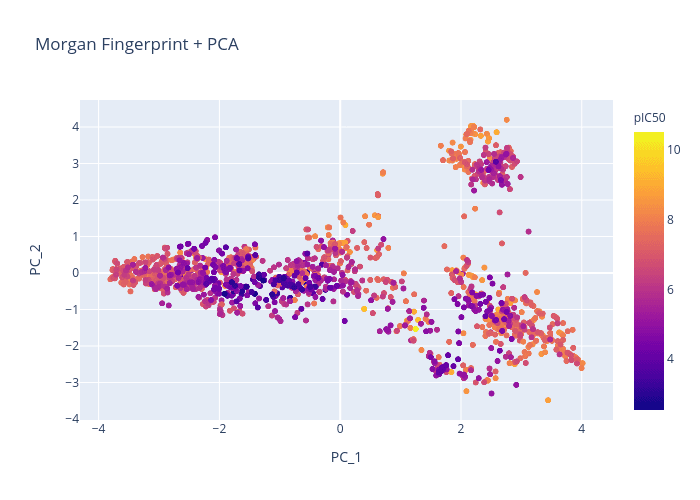
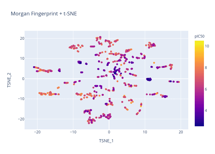
Here is a quick comparison of the different chemical representations and dimension reduction techniques:

Figure 1. Morgan Fingerprint + PCA

Figure 2. Morgan Fingerprint + t-SNE

Figure 3. RDKit + PCA

Figure 4. RDKit + t-SNE
Creating Dash App
Now that we’ve generated some graphs, we’re onto the last step of this process: displaying 2D images of the molecules on hover! For this, we will be using Dash, a python framework for creating interactive web applications.
Basic Dash Layout
A Dash app is composed of a tree of nested components that can take the form of
HTML elements (
dash.html): basic components like headers, paragraphs, imagesDash Core Component elements (
dash.dcc): higher-level, interactive components like graphs, drop-downs, tooltips
All components can be given an identifying id for future reference. HTML components can be styled with a CSS dictionary. Our app will be composed of a DCC Graph component that renders our plotly graph and a DCC Tooltip that allows the user to point to a precise location on the graph.
The following code generates a basic Dash app that displays the plotly graph above without any hover functionality. Note that we are using JupyterDash, which gives us the option to display the graph inline in a Jupyter notebook in addition to externally on a web browser.
Setting debug=True in app.run_server allows the app to update in real-time as changes are being made to the code. Additionally, a port must be specified (default is 8050) and forwarded to display the app interface inline. Make sure you manually forward the port in a Jupyter notebook as the app will not fully render otherwise.
Basic Dash Callback
In order to display molecules on hover, we need to add interactivity to our app. More specifically, we want to add a callback function that updates our Dash interface whenever we hover over a point on the graph.
Callbacks are handled by the @app.callback decorator, which which takes in input and output arguments. The inputs and outputs of @app.callback are properties of components, which are referenced by their ids.
The decorator causes the function that it wraps to be called anytime there are modifications to the input components. Therefore, the wrapped function must specify how the output should be updated. This function must be written directly after the @app.callback decorator (no empty lines) and take in input properties as arguments.
In our case, the input is the hoverData attribute from the Graph component and our output is the data displayed by our Tooltip component.
Now, we have to define a function that describes how our Tooltip is updated in response to changes in the Graph’s hoverData. This function should:
Generate a 2D molecule image from a SMILES that can be displayed in an HTML Image component.
Display an HTML Div that contains this image, along with the molecule name and any other captions that are specified.
Putting Everything Together
Here is the final code that implements everything we went over. Note that we also added in drop-downs so that the chemical representation and dimension reduction technique can be modified within the Dash app.